I met Chris Brown in 1991 when he came to make prints at Crown Point Press. Later, Pam Paulson and I worked with him several times at Paulson Bott Press (now Paulson Fontaine). We didn’t discuss art much, although we looked at photographs together, because they were the inspiration for much of his work.
He always came to the studio smiling and had an even temperament whenever there was a challenge. He always included the printers in finding the solution. I think his years of teaching influenced his approach to working with other people.

Christopher Brown 1997 in New York
I’ve loved watching Chris’s evolution as an artist. In 1995 Chris moved to New York City to turn from figurative to abstract work, and then after a couple of years, he came back to the Bay Area and returned to figurative work, but imbued with abstract elements, blending the two styles. By putting his images in an unreal space, he continues to explore ways to make a painting more than just a representation of a photograph.

Christopher Brown: Velasquez’s Hands, 1995, Color aquatint with soft ground, 29.5 x 29.75” edition of 50
RB: How has your printmaking influenced your painting?
CB: Because etching is such a beautifully malleable medium—like oil painting—I’ve always found it to be perfect for the way I like to work. It allows for a much broader range of invention and expression during the making process than any other printing medium; nothing else comes close. For me, working back and forth between painting and printmaking over the years has been a creative luxury, though I’d have to admit it can also be hard work. Etching can be physically demanding, but there’s a part of me that likes even that.
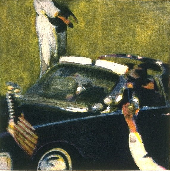
RB: Do you feel like your interest in what you were painting was mostly formal? There must have been some kind of emotional attachment to the Zapruder film and the Civil War photos.
CB; It's a great question, Renee, because it embodies so much of what painting is about. On the one hand, what we learn from going to museums is that it really doesn’t matter what an artist paints; we’re willing to look at—and even be amazed by—almost any kind of image, from a picture of Jesus to a hay field to a canvas splattered with dripped and poured paint. What’s clear is that painting is not about “what” but “how.” That said, painting is an ongoing dialogue about what “good” painting is. To paraphrase Joseph Campbell’s definition of art has always been a helpful starting point for me: “art is metaphor for the experience of life.”

Christopher Brown Berkeley Studio, 1983
The difficulty for every young artist is twofold: first, to see the world itself as “fascinating,” an attitude adjustment more difficult than it sounds, and then to develop the perseverance to describe one’s own fascinations in very personal, emotional ways rather than easy cliches. The point is that painting is not so much about a subject as it is the artist’s emotional reaction—expressed in form and color—in paint, to that subject.
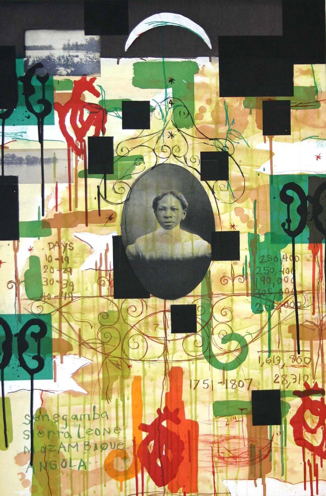
For reasons I didn’t really understand, I became fascinated by 19th-century photographs of the Civil War and photographic “stills” taken from the Zapruder film of the Kennedy assassination, and my attempts to make paintings based on both were attempts to explore my own fascination. Many people naturally thought I was deeply interested in history, that I was a Civil War buff, etcetera, but that was never really the case. My interest was visual, primarily, and had to do with the challenges of describing the past rather than the present, with uncertainty and movement rather than still-life–like clarity.
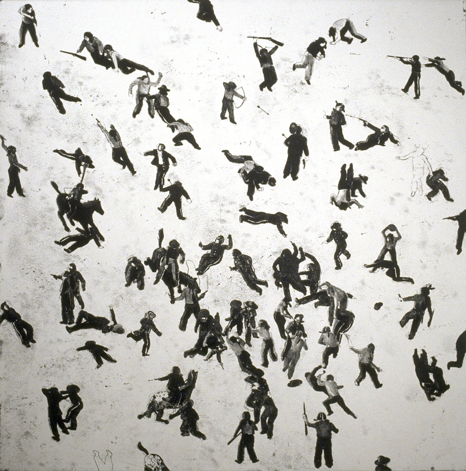
Christopher Brown: Seventy Nine Men, 1991 Softground Etching Image size: 30 x 30" Paper Size: 42 x 41" Edition 25
Over the period of years it took to make those paintings, I learned a lot about myself as painter: that I wanted to find a way to make my erasures, reconsiderations, and reworking—my indirect, messy process—read as a metaphor for the ways we understand and misunderstand history and life. To call the paintings “Civil War” paintings was to apply a misnomer, a bit like calling Cezanne’s still lifes his “apple paintings.” The subject matter was really just a very convenient and adaptable subject for my painterly exploration.
RB: But what about the emotional side of painting, and issues of one’s own personal history, as well. How do those elements enter into it, or do they?
CB: They do, they have to, for painting to truly come alive. They are reflected in the choices that artists make in selecting what to paint, and how. When we look at paintings, we see so much—the formal choices, the subject matter, and the social context—but also the artist’s touch and his/her choices. Paintings are “about” a lot of things, but they are always, foremost, reflections of the person that made them. When I was speaking of my own work a moment ago, I mentioned gradually finding a way of working that let my mistakes show, of sidestepping “perfection,” as it were, so feeling and emotion could play a larger role. That is still and always the challenge for me, to bring feeling into my work. As Wayne Thiebaud liked to say, the challenge is to paint the life of the world, and not to merely represent it as a kind of taxidermy.
RB: When do you stop working on a painting?
CB: A painting is an ongoing investigation, a meditation, a dialogue with one’s deeper intuitions and imagination that resist the controls of the conscious mind. That dialogue is the most fascinating thing to me about painting, and I’ve often felt that “finish” happens at arbitrary moments. Paintings could almost be endless propositions, every move begetting another into infinity. But there are other forces at work too, and resolution can be a kind of release, and even, at times, a satisfaction. And it can also be pretty nice just to have an idea, execute it with speed and vigor, and say, that’s it!

Chris hand applying acid to a copper plate at Paulson Bott Press, 2010
Self-doubt and a real inability at times to see the good in something raw and unclear have plagued me. I’ve come only slowly to understand that my paintings are almost always out ahead of me, that my intuitions have wisdom and are beyond the capacity of my controlling mind to understand. I know from photos I’ve taken of my paintings in progress that I’ve destroyed as many good paintings as I’ve made by going too far, letting “the perfect” be the enemy of the good and my doubt overwhelms my courage. I still have so much to learn. It’s humbling.
RB: Has your approach to artmaking changed over the years?

Christopher Brown: Berkeley Studio, 2002
CB: I’m an explorer. I’ve tried, and am still trying, many different kinds of things. Throughout my life, I’ve always felt an obligation to the intellectual freedom embodied in most notions of the artist’s life, and I’ve taken it seriously. I’ve been lucky to not have to have a regular 9-5 working life, and I’ve wanted to use that freedom not for careerist motives or “success” but rather for exploring in the deepest sense what it means to be a painter in the modernist and postmodernist era. In the simplest terms, that meant exploring both abstract and representational painting and continually trying new things that weren’t particularly successful at times.

Outside Betty’s Diner on 4th Street 1989, photograph by Deborah Oropallo
But fundamentally, my approach remains the same no matter what I do. I just start painting based on the slightest whim or intuition about what might be interesting and let the process of creative exploration begin. I make paintings, sand them down, turn them upside down, take them apart, and put them back together. Sometimes they work, and often they don’t, but I feel like there’s a deep curiosity, an investigative urge that I have to give myself over to, that I’m not quite the one in charge.